Pattern Classification For COVID-19 Growth Data
On 2nd Feb, I launched a web dashboard for tracking the spread of recent coronavirus (COVID-19) outbreak, which provides a real-time …
Everything You Need To Know About Correlation
Correlation is one of the most fundamental statistical concepts used in almost any sectors.
For example, as in portfolio management, …

Ten Tricks To Speed Up Your Python Codes
Python is slow.
I bet you might encounter this counterargument many times about using Python, especially from people who come from C or …

An Overview Of Importing Data In Python
The prerequisite for doing any data-related operations in Python, such as data cleansing, data aggregation, data transformation, and …

Elevate Your Dashboard Interactivity In Dash
Last week, I shared with you how to make a dashboard to track the spread of coronavirus using Dash in python, from which you can have a …

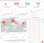
Build A Dashboard To Track The Spread of Coronavirus Using Dash
Last month, I published four posts to share with you my experience in using matplotlib. Benefit from its full control of elements on a …
Create An Infographic Using Matplotlib
From my previous posts about the hierarchical structure of matplotlib plotting and the many ways to instantiate axes, we can see that …
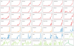
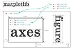
The Many Ways To Call Axes In Matplotlib
Although matplotlib is extremely powerful and the only limitation might be our imagination, it is a bit challenging for new users to …
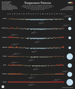
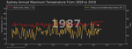
How To Visualise Sydney’s Temperature Change from 1859 to 2019 Using Matplotlib
I believe one of the main current events you have read about must be the Australian Bushfire Crisis. The devastating disaster has …
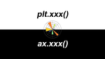
plt.xxx(), or ax.xxx(), That Is The Question In Matplotlib
As a newbie converted recently from using R to Python, data visualisation via the standard Python visualisation library matplotlib is …